🔎 Unit Overview
In this topic, you will be introduced to data science, and by the end of the unit you will be empowered by knowing how to use data to investigate problems and make changes to the world around you. You will also be exposed to both global and local data sets and gain an understanding of how visualising data can help with the process of identifying patterns and trends. Towards the end of the unit, you will go through the steps of the investigative cycle to try to solve a problem in the school using data.
🎯 Learning Objectives
- Define data science
- Explain how visualising data can help us to identify patterns and trends in order to gain insights
- Use an appropriate software tool to visualise data sets and look for patterns or trends
💬 Key Vocabulary
- Data science
- visualisation
- insight
- infographic
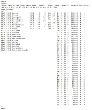
📝 Starter Activity – Interpret the data
- What is this data showing you?
- What information can you extract from it?
- Does it tell you a story?
Think/pair/share
Click this link to the see the data in a spreadsheet.
📖 What is data science?
Data science is extracting meaning from large data sets in order to gain insights to support decision-making.

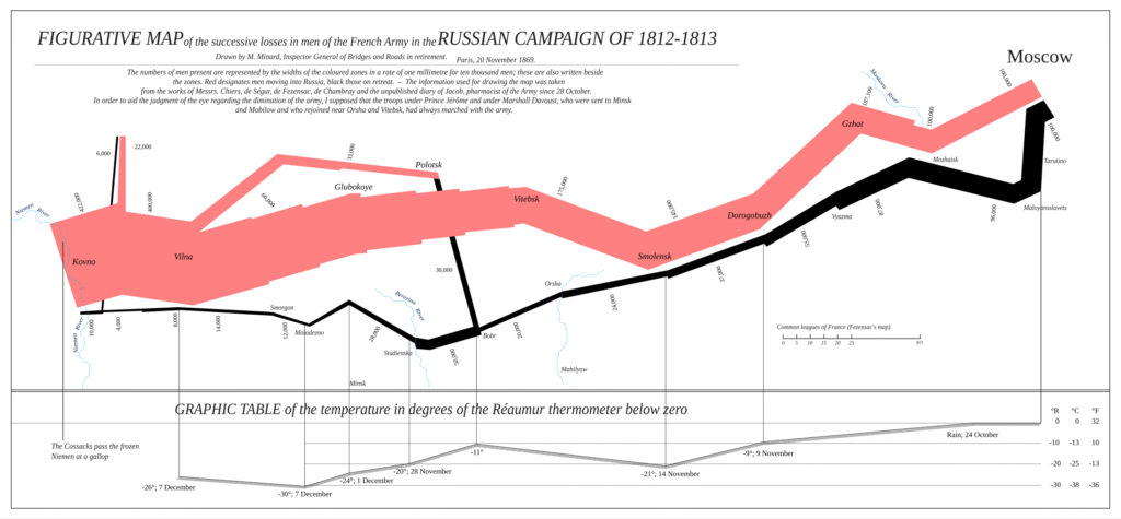
📖 Visualising the data & Joseph Minard
Joseph Minard used these numbers in 1869 to find meaning and tell a story with the data.
The data you looked at before relates to Napoleon’s march on Russia in 1812.
The numbers by themselves don’t tell much of a story, but Joseph Minard created what is widely regarded to be the best statistical graph of all time.
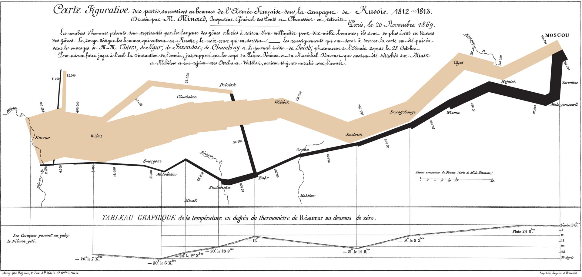
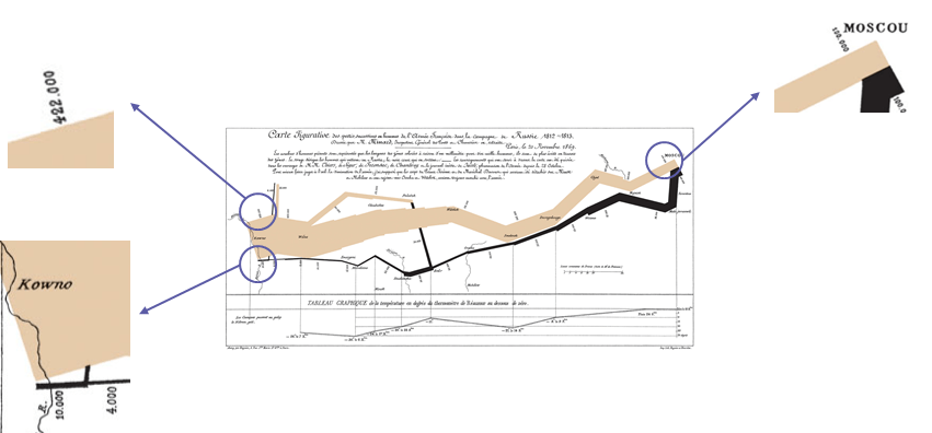
The width of the beige lines represents the number of soldiers marching towards Moscow, while the black line is the retreating soldiers. It is clear to see from the width of the line how the number of soldiers diminishes the further they march. Napoleon started with 422,000 troops; by the time he reached Moscow, 322,000 soldiers had died, and when he returned to France there were only 10,000 remaining.
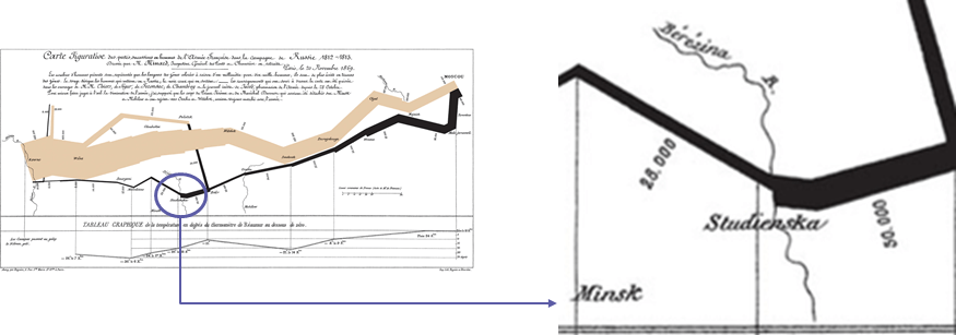
The visualisation also includes elements of geography, such as locations and the rivers the troops had to cross. On 28 September 1813, the data labels on the black line read 50,000, then 28,000. This shows that 22,000 men died crossing the Berezina river near Minsk.
Finally, the line chart at the bottom of the image represents the temperature. At some points on the journey, the temperature reaches -30 degrees Celsius.
This is simply a different representation of the data that we looked at earlier on in the lesson, and that by visualising it in this way, we can draw far more information from it.
Click here for an English translation of the graphic
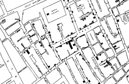
📖 John Snow’s visualisation
In 1854 there was an outbreak of cholera in the Soho area of London.
At the time it was widely believed that cholera was caused by pollution in the air.
John Snow’s observation of the evidence led to him discounting this belief, but he could not prove how people did become infected.

📝 Level 1 – Help prove John Snow’s theory
John Snow made a dot map of Soho.
The dots (or shaded-in parts) on the map represent where a cholera-related death had occurred.
In pairs, look at the map in more detail and answer the questions on the worksheet.
📖 Visualise data
UK television networks want to gain a better understanding of how viewers watch the most popular TV shows on mobile devices.
The aim of this activity is to:
- Analyse a small data set of TV viewing figures
- Visualise the data
- Use the visualisation to provide an insight to the broadcasters

📝 Level 2 – Provide the insights
Example insights:
- Which of the TV shows were most popular on a PC or mobile phone?
- Does the rank of those watched on TV match the rank of those watched on a different medium?
Once you have chosen your visualisation, use the worksheet below to answer the questions and provide your insights.

📖 Infographics versus data visualisations
Data visualisations are visual representation of data (such as charts and graphs) intended to help an audience process the information more easily and get a clear idea about the data at a glance.
Infographics are visual representations of data, often involving pictures that reflect patterns and help tell a story.
Infographics can include visualisations.
📖 Creative visualisations

📝 Level 3 – Space Data
In the worksheet below you have been provided with a small data set about our solar system.
Complete the worksheet by visualising the data and providing an insight.
The visualisation might be something as simple as distance from the sun, but you might want to compare two values, such as distance from the sun and temperature.
The visualisation can be done by hand (be creative) or you could use the website we used in the lesson today.

🏅 Level Up
🥇 Level 1
- Upload the Level 1 – Mapping Data worksheet to Teams.
🥈 Level 2
- Upload the Level 2 – Insights worksheet to Teams.
🥉 Level 3
- Upload the Level 3 – Space Data worksheet to Teams.
In this lesson, you…
- Looked at historical examples of data visualisations.
- Visualised your own data set to help spot any patterns or trends.
Next lesson, you will…
- Analyse larger global data sets and visualisations.
- Look at examples of how data collection and storage has changed with technological advances.